How Do You Navigate FM26?
FM26 uses a horizontal top navigation system instead of the traditional left sidebar.
Players access key sections through the top menu and use contextual sub-tabs to move within each category.
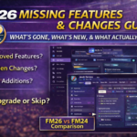
Football Manager 2026 didn’t just change tactics. It changed how you interact with the game and for many managers, the biggest challenge isn’t winning matches — it’s finding the screen they’re looking for.
If you’ve ever asked:
“Where did they move that?”
“Why is this buried under three tabs?”
“Why does this feel slower than before?”
This guide is for you.
We’re going to break down:
The new FM26 UI structure
Hidden navigation shortcuts
Where key screens are now located
How to optimize workflow
How to reduce click fatigue
By the end, FM26 will feel efficient — not frustrating.
1️⃣ Understanding the New FM26 UI Philosophy
The first thing you need to understand:
FM26’s interface is built around contextual grouping, not legacy menu structure.
Instead of separating features by category (Tactics, Squad, Training), the UI now groups screens by functional workflow.
This means:
Recruitment-related tools are more centralized
Tactical data connects to match analysis
Player development links to dynamics
But if you’re coming from FM24, muscle memory will betray you.
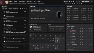
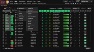
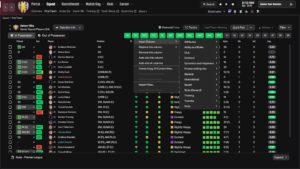
This is the overview dashboard of the game
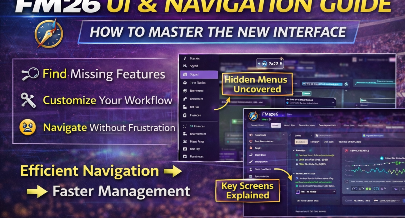
2️⃣ The New Top Navigation System – What Replaced the Sidebar?
One of the biggest UI changes in FM26 is the complete removal of the traditional left sidebar.
Instead of vertical navigation, FM26 now uses a horizontal top navigation bar as the primary control system.
This fundamentally changes how you move around the game.
Rather than scanning a permanent sidebar for sections, you now:
Select a main category from the top menu (Squad, Tactics, Training, Recruitment, Data Hub, Club, etc.)
Navigate using contextual sub-tabs that appear beneath it
Access layered content panels within that section
This new structure is cleaner and more modern, but it requires a short adaptation period — especially for long-time players used to the old layout.
The key difference is philosophical:
FM26 is built around workflow navigation, not static menu access.
Instead of jumping between disconnected sections, the interface now keeps related tools grouped within contextual environments.
It may feel unfamiliar at first, but once you adjust, movement inside the game becomes more fluid and logical.
3️⃣ Where Did Key Screens Move?
Let’s solve the most common frustrations.
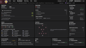
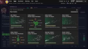
🔎 Where Is Detailed Player Analysis?
Now located under:
Squad → Player Profile → Performance tab
But advanced breakdowns are often nested under dropdown filters.
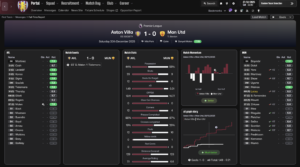
📊 Where Is Advanced Match Data?
Match data is now deeply connected to:
Match → Post Match Review → Match Report
Instead of separate match stats screens, FM26 pushes you toward Data Hub overlays.
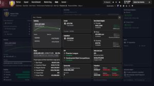
💰 Where Is Club Finances?
Now under:
Club → Finances
But financial breakdowns are layered across tabs:
Overview
Wages
Projections
Sponsorship
4️⃣ Hidden Efficiency Hacks Most Players Don’t Use
FM26 UI becomes much faster when you:
✔ Use right-click contextual menus
✔ Use search bar for screens
✔ Customize sidebar order
✔ Use quick filters in Data Hub
✔ Save custom views
Many managers still navigate like it’s FM20.
That’s inefficient.
5️⃣ How to Reduce Click Fatigue in FM26
Click fatigue is real.
Here’s how to fix it:
✅ Customize Your Sidebar
Drag most-used sections higher.
✅ Save Tactical Views
Save analysis layouts so you don’t rebuild them every time.
✅ Use Inbox Smart Filters
You can filter inbox messages by priority.
6️⃣ Why FM26 UI Feels Different (But Isn’t Worse)
Most frustration comes from:
Changed muscle memory
Reduced visual clutter
More layered information
Fewer obvious buttons
But once you adapt, workflow actually becomes faster.
FM26 is less “menu hopping.”
More “workflow based.”
It just requires recalibration.
7️⃣ The Most Common FM26 UI Mistakes
❌ Not exploring contextual tabs
❌ Ignoring right-click features
❌ Not customizing views
❌ Looking for old FM24 locations
FM26 is not hiding features.
It’s reorganizing them.
8️⃣ Final Verdict – Is FM26 UI Actually Better?
For beginners: Yes. Cleaner.
For veterans: Initially frustrating.
Long-term: More efficient.
Once optimized, you spend less time navigating — more time managing.
And that’s the point.