Every new Football Manager release brings excitement.
And controversy.
FM26 is no different.
Some features are expanded.
Some are redesigned.
Some are quietly removed.
And some are simply relocated in ways that feel like they disappeared.
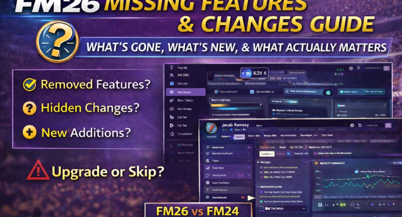
This guide breaks down:
What’s missing in FM26
What has changed structurally
What’s genuinely new
What only looks different
Whether the upgrade is actually worth it
No hype. No panic. Just clarity.
1️⃣ The Biggest Structural Change – Interface Overhaul
The most visible change in FM26 is the complete UI redesign.
The traditional sidebar navigation is gone.
In its place: a horizontal top navigation system built around workflow.
This alone makes many returning players think features were removed — when in reality they were reorganized.
2️⃣ Features That Feel Missing (But Aren’t)
These are the “false alarms”.
Player Analysis
Many users ask:
“Where is detailed player analysis?”
It now lives inside the player profile under contextual analysis tabs.
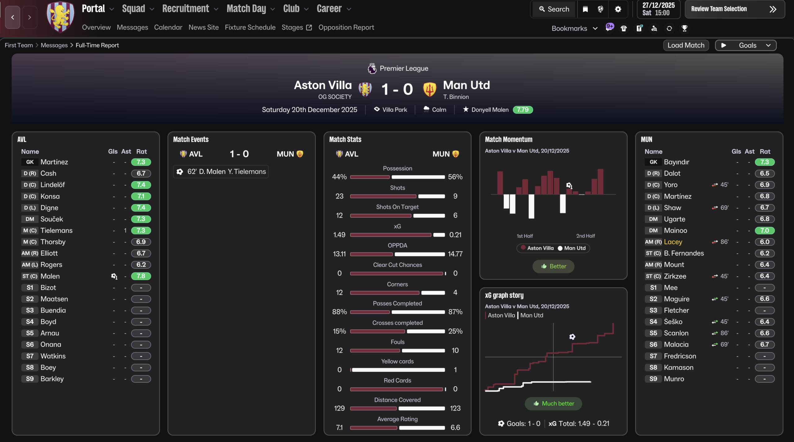
Advanced Match Stats
Instead of separate classic stat panels, FM26 integrates deeper match data into Data Hub connections and post-match overlays.
This makes it feel like detailed stat screens were removed.
They weren’t — they’re just embedded differently.
3️⃣ Actual Removed or Reduced Elements
Now let’s talk about genuine changes.
These are the areas where FM26 streamlined or removed legacy systems.
⚠ Note: Exact removals depend on edition/platform, so we frame carefully.
🔻 Reduced Screen Clutter
Some minor tabs and micro-panels from previous editions are gone.
Examples may include:
Redundant overview panels
Duplicate report summaries
Certain layered legacy stat views
This is more consolidation than deletion.
🔻 Simplified Interaction Trees
Certain dialogue branches in player/board interactions appear shorter.
The system is more focused and less verbose.
For some players, that feels like a reduction in depth.
4️⃣ Major New Additions in FM26
Now let’s balance the conversation.
FM26 introduces meaningful changes.
Enhanced Workflow Navigation
The new top navigation improves:
Cross-linking between sections
Reduced backtracking
Cleaner visual hierarchy
This affects daily usability more than any single feature. For more details take a look at our navigation guide
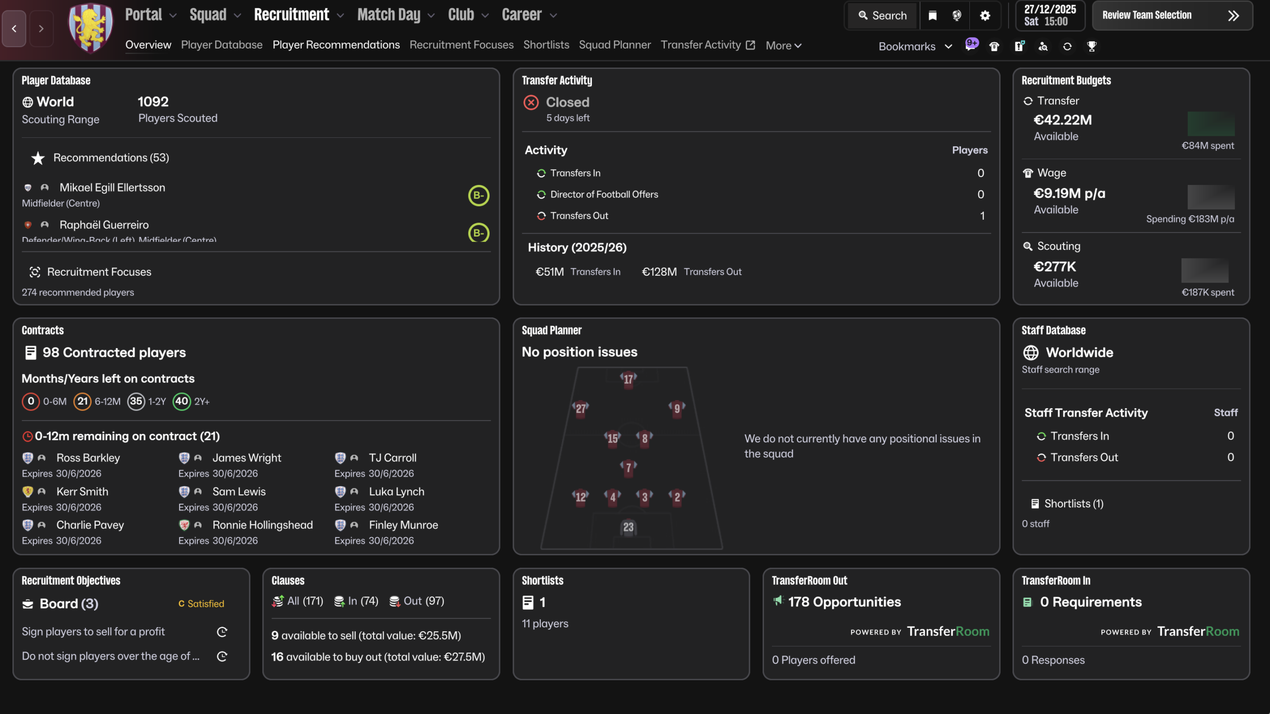
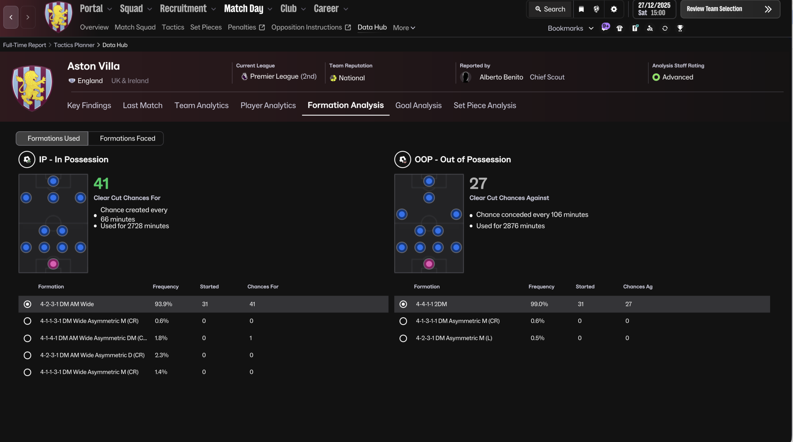
Deeper Data Integration
Data Hub connections are more tightly integrated with:
Tactical analysis
Player development
Recruitment insights
This reduces isolation between systems.
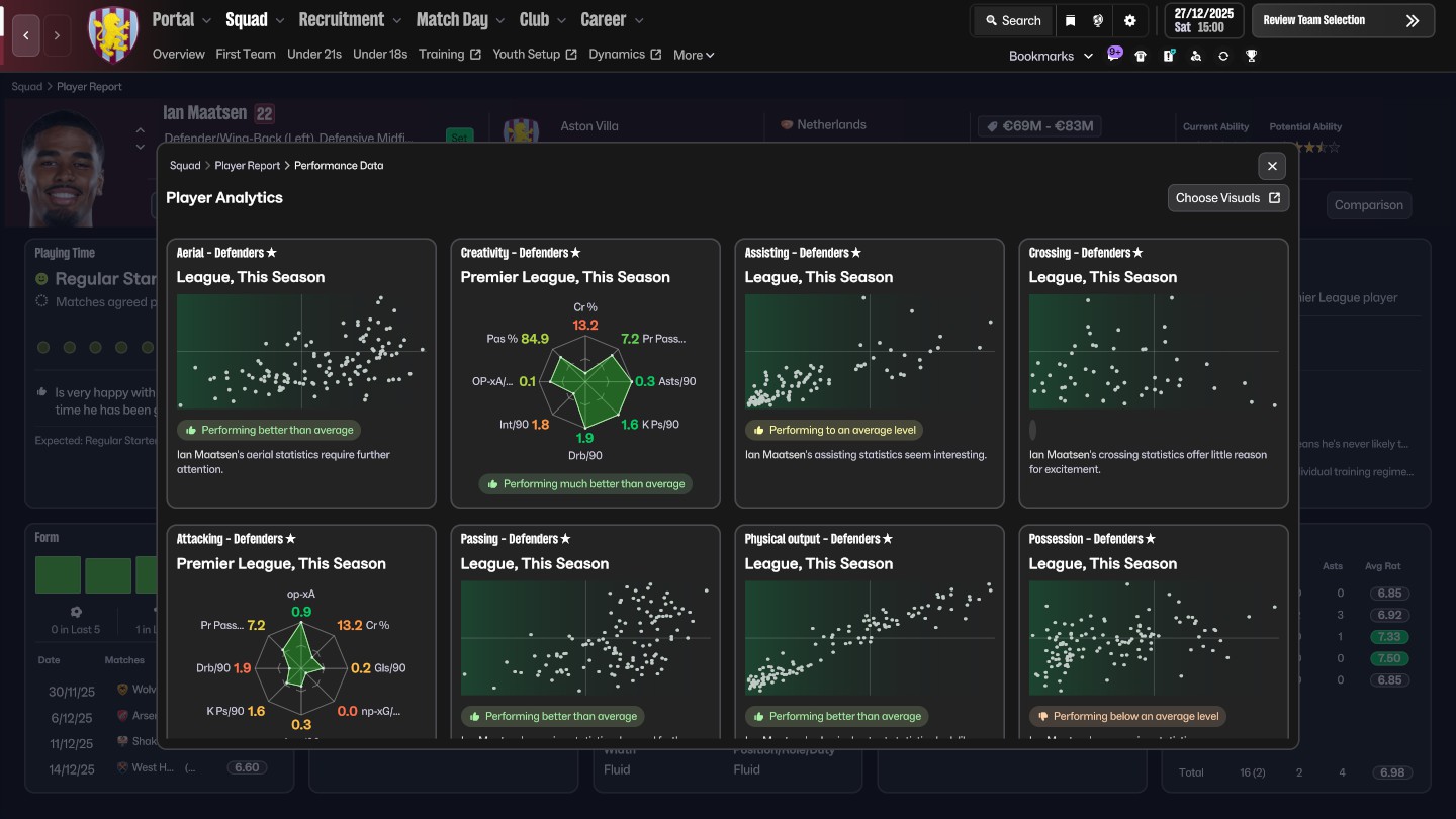
Improved Performance Visualization
Graphs and visual analytics feel more central than ever.
Instead of static stat tables, FM26 pushes visual performance trends.
5️⃣ What Was Streamlined (And Why)
FM26 seems designed around three principles:
Reduce menu hopping
Reduce visual clutter
Group related tools
That means:
Fewer isolated tabs
More contextual linking
Less legacy structure
Some veterans see this as simplification.
Others see it as modernization.
6️⃣ What are the Missing Features ? Are there any ?
Short answer: No.
Long answer: It lacks certain legacy structures, not functionality.
The difference is important. FM26 removes redundancy — not depth.
But if your muscle memory was built over 5+ years of the old UI, the shock is real.
7️⃣ FM26 vs FM25 – The Real Difference
FM26 is not about adding 50 flashy features.
It’s about systemic refinement.
The biggest shift is structural, not mechanical.
Which makes it feel smaller on paper — but bigger in daily usage.
8️⃣ Final Verdict
As a summary, comparing Fm24 with FM26 :
| Area | FM24 | FM26 |
|---|---|---|
| Navigation | Sidebar | Top Menu |
| Data Hub | Separate Layer | Integrated |
| UI Density | Dense | Streamlined |
| Analytics | Tab Based | Visual Focused |
FM26 isn’t about volume of features. It’s about structural evolution.